Scaling Design with Purpose: Our Journey with GSG
When Atolls approached me, they were navigating the complexities of managing 47 white-label platforms, each uniquely branded for different partners. While this customisation offered flexibility, it introduced significant challenges in scalability and consistency. My mission was clear: develop a unified design system that maintained branding flexibility while streamlining updates and ensuring consistency across platforms.
Client
U&H Fashion
Year
2021 - 2025
Services
Content Strategy
Design
Development
Awards
Awwwards
CSS Design Awards
The Webby Awards


Listening to Understand
The journey began by engaging directly with stakeholders. Through surveys and interviews with 15 partners and 50 end-users, we uncovered a narrative of fragmented workflows and design inconsistencies.
Partners expressed frustration over the time-consuming nature of updates, while end-users noted subtle design differences that disrupted trust. A striking insight emerged: 60% of stakeholders reported inefficiencies when applying updates across platforms, highlighting the need for a scalable solution.

Collaborative Ideation
Armed with these insights, the team and I initiated collaborative design sprints, brainstorming ways to make the system modular. We sketched reusable components, dynamic theming options, and configuration tools. A pivotal idea was the implementation of design tokens, variables for colors, typography, and spacing that could be easily customized without altering the core structure. This approach promised a flexible yet consistent design framework.
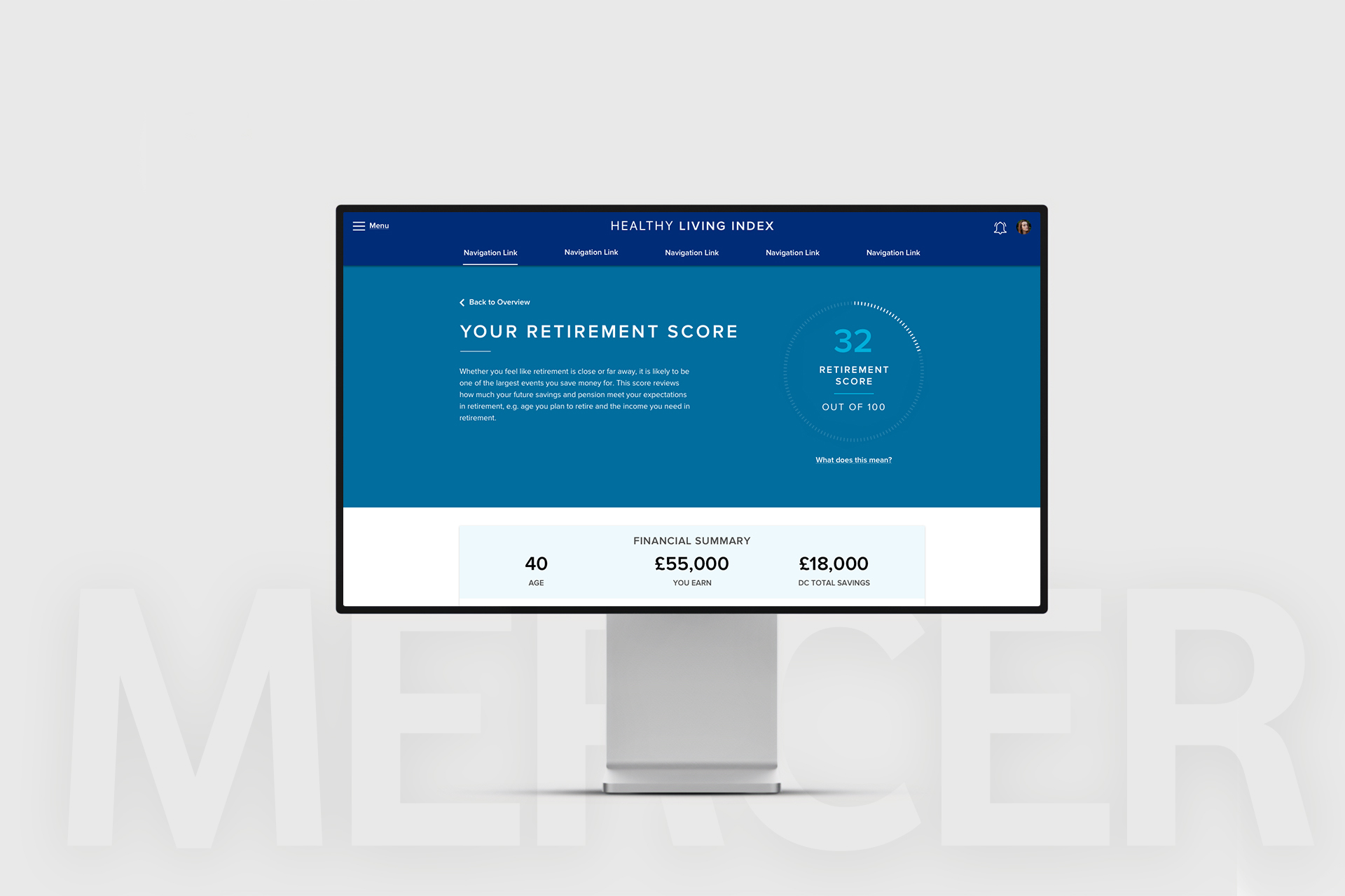
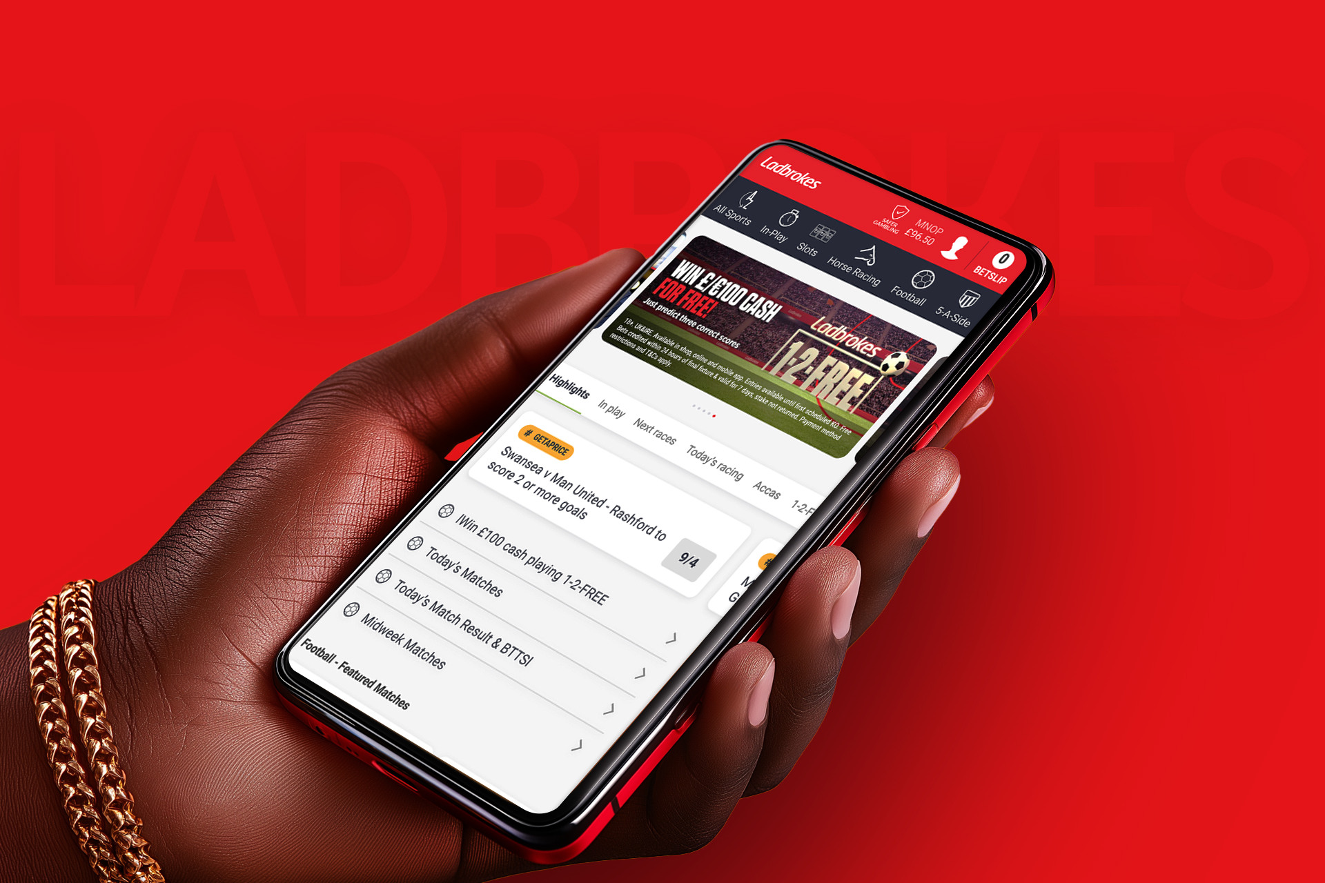
Designing a Scalable System
We approached the design system not just as a library of components, but as a living product with scalability and adaptability at its core. Starting with low-fidelity wireframes, we explored layout structures, reusable UI patterns, and interaction models that could flex across 47 unique white-label platforms.
As we moved into prototyping, we prioritised modularity every component was designed to be configurable, from buttons to banners to navigation. One of our key breakthroughs was introducing a real-time theming prototype that allowed stakeholders to test brand configurations live. This hands-on experience validated our hypothesis: giving users immediate visual feedback on changes significantly increased confidence and adoption.
To maintain consistency while enabling customisation, we implemented a system of design tokens. These tokens—representing variables like color, typography, spacing, and elevation—became the single source of truth for visual styling. Instead of editing styles across multiple codebases, partners could now simply update their token set to reflect brand identity, without touching the underlying components.
We documented rules and usage guidelines for every component, supported by clear token hierarchies (global, thematic, and contextual). This structure not only streamlined development but ensured visual consistency across platforms even as branding varied.
By the end of the design phase, we had built a robust, scalable foundation that empowered both designers and developers to move faster, with confidence and clarity.
Pantone® 532 C
C71 M65 Y64 K72
#232323
Pantone® 186 C
C6 M100 Y100 K1
#df0015
Pantone® 663 C
C02 M01 Y01 K00
#f7f7f7
Testing and Refinement
We conducted remote usability testing with 15 participants across multiple partner brands to ensure the system performed consistently under varied visual identities and content structures. Testing focused on real-world tasks, navigating dashboards, customising themes, and interpreting metrics desktop, tablet and mobile.
Users highlighted the need for more contextual support, leading us to introduce dynamic tooltips and inline guidance. We also uncovered accessibility issues in certain brand overrides, prompting refinements to our token system to enforce contrast and type scale standards.
A/B testing helped us optimise responsiveness and interaction patterns across devices. These iterative improvements ensured the design system was not only flexible, but also accessible, intuitive, and ready to scale.
Delivering Tangible Results
The impact of our design system was significant:
Setup times decreased by 50%, enabling faster launches.
Visual consistency scores improved by 35%, strengthening brand trust.
Task completion rates rose by 20%, enhancing usability.
For GSG, the system transcended operational efficiency—it became a growth enabler. With faster onboarding, they could scale partnerships seamlessly. As one partner noted:
“Rebranding used to take days. Now, it’s done in hours.”