Cultivating Growth
Mercer's Journey to Redefine Employee Experience
In the ever-evolving landscape of work, where employee expectations shift as swiftly as market dynamics, Mercer recognised a pressing need: to reimagine the employee experience. This wasn’t just about perks or policies, it was about fostering a culture where employees felt seen, heard, and valued.
As the UX Lead, I was responsible for driving the end-to-end design strategy, from research to delivery, while aligning cross-functional teams.
Building a Scalable, Connected Ecosystem
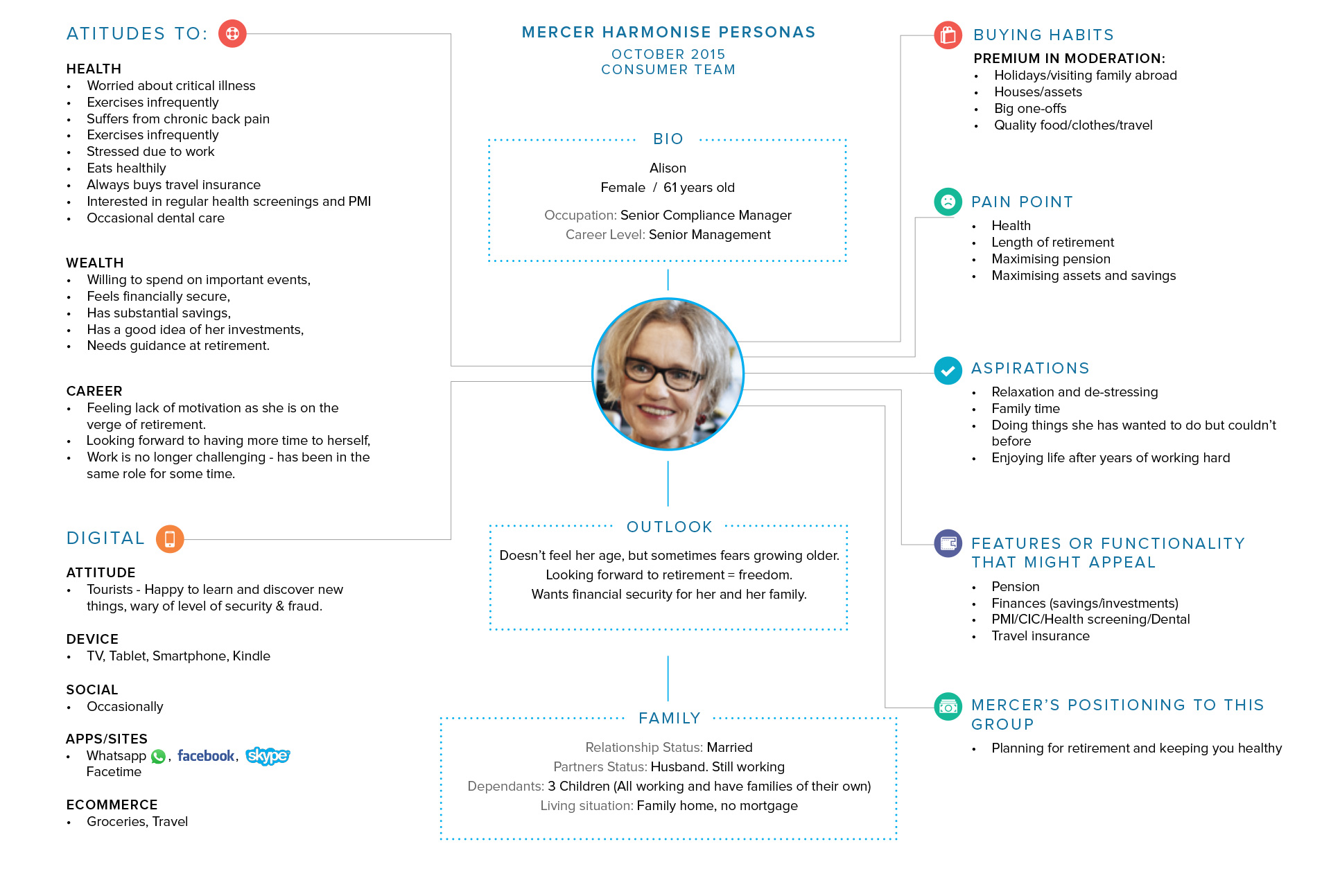
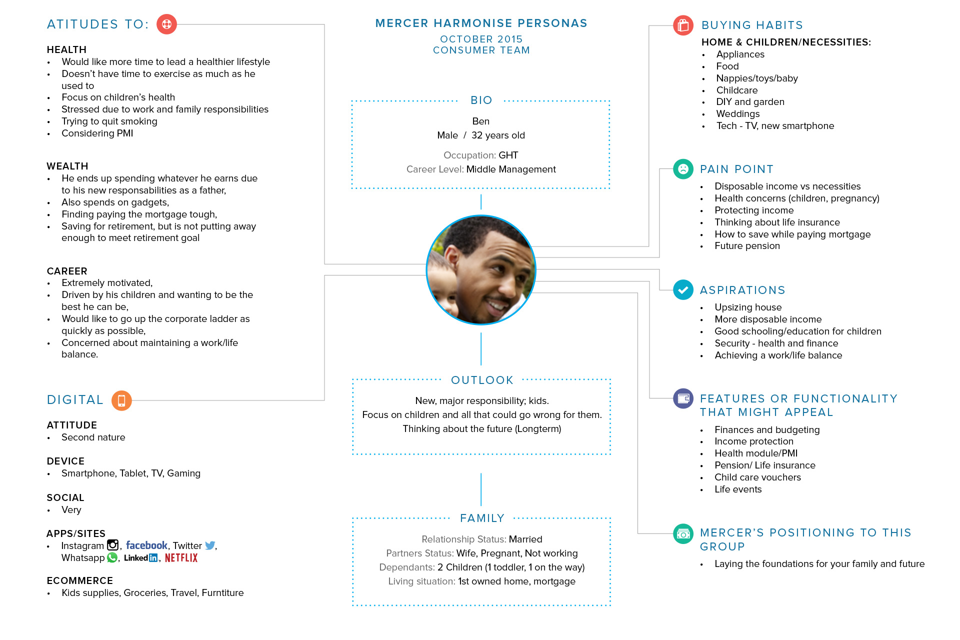
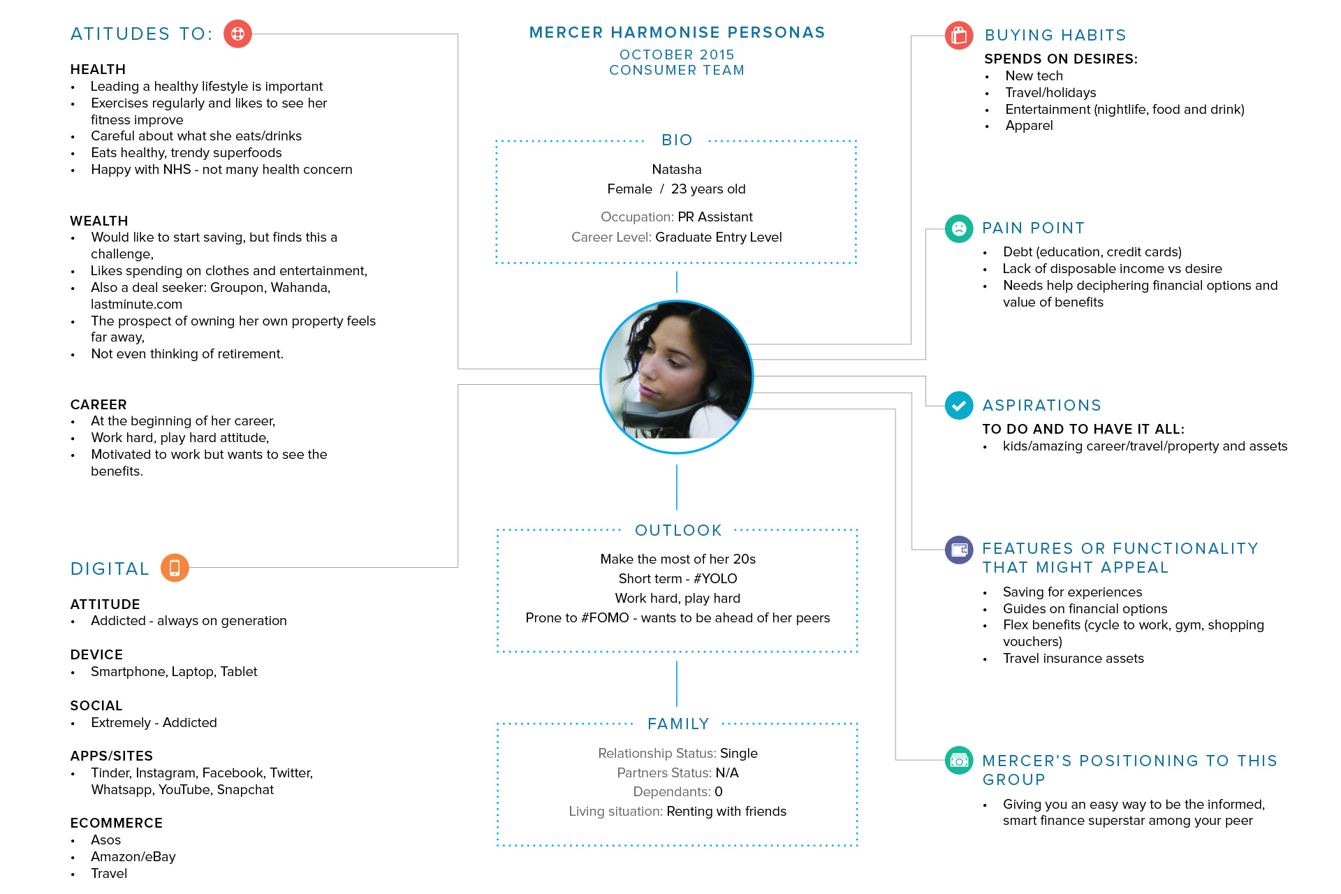
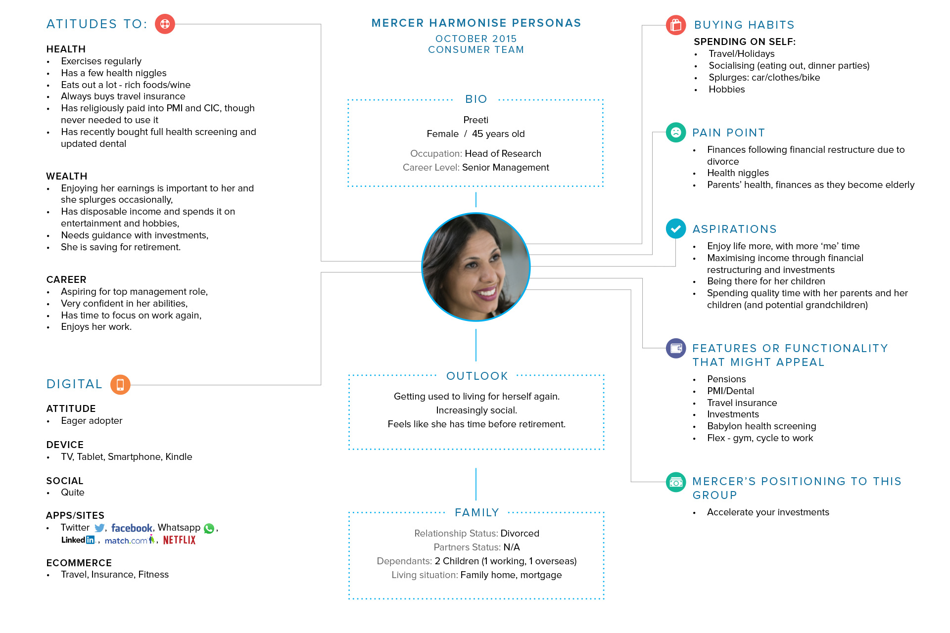
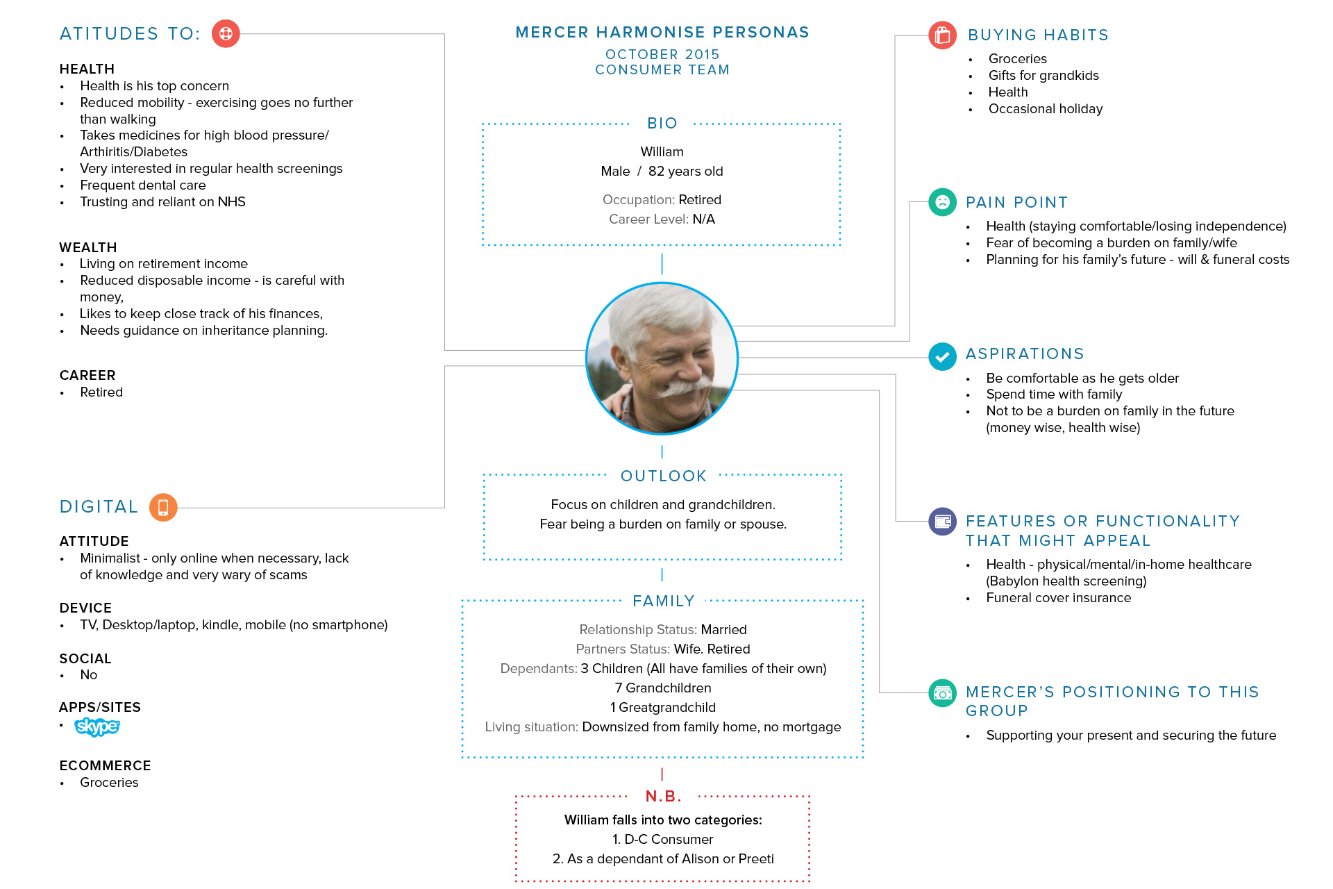
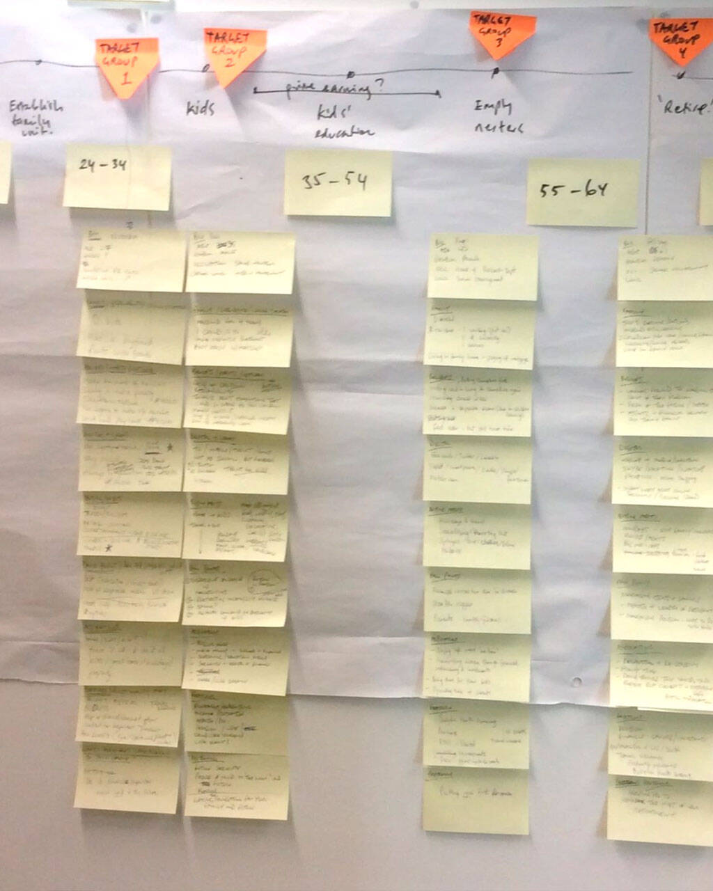
Our journey began with a deep dive into the everyday experiences of Mercer’s employees. Together as a team, we set out to truly understand what mattered most to them. We conducted one-on-one interviews, facilitated focus groups across departments, and distributed surveys to employees in different regions and roles.
Piece by piece, we started to build a fuller picture of the employee experience mapping their journey from that very first onboarding moment to long-term career growth. To design a solution that was genuinely user-centric, we cast a wider net. Alongside our qualitative research, we dove into competitor analysis, dissected market trends, and explored internal data analytics.

Co-Creating Solutions with Empathy
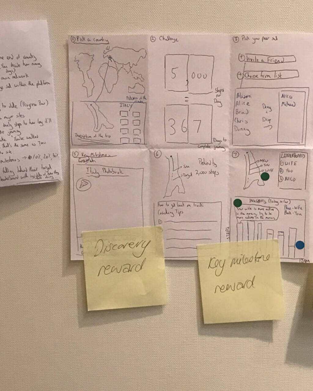
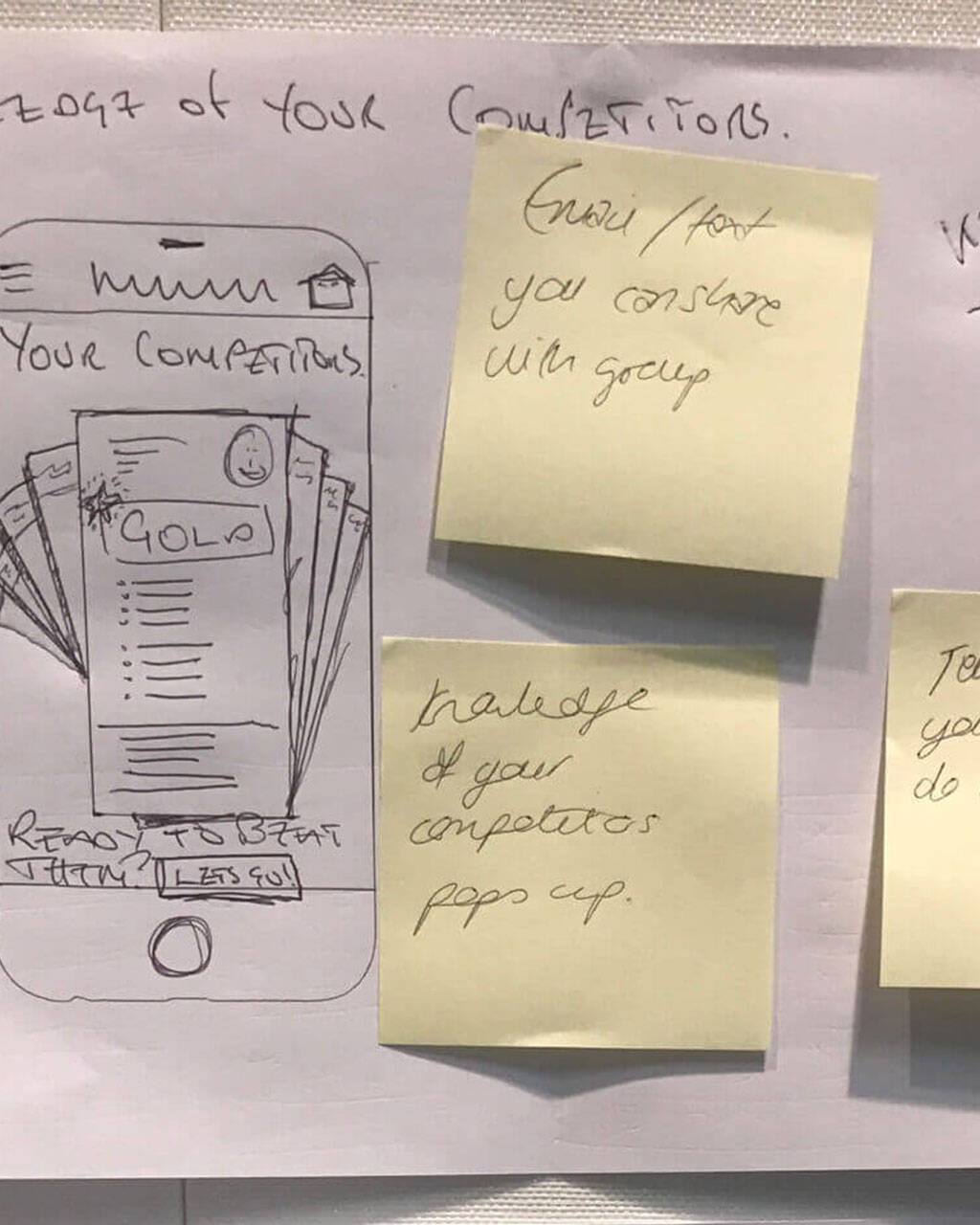
With insights in hand, our team moved into design mode driven by a simple idea: build with employees, not just for them. We invited them into co-creation sessions, where their feedback directly shaped the platform from the ground up.
We approached the experience as if employees were customers, prioritising clarity, ease, and engagement. Diversity and inclusion remained at the core, ensuring the solution reflected the varied needs and voices across the organisation.
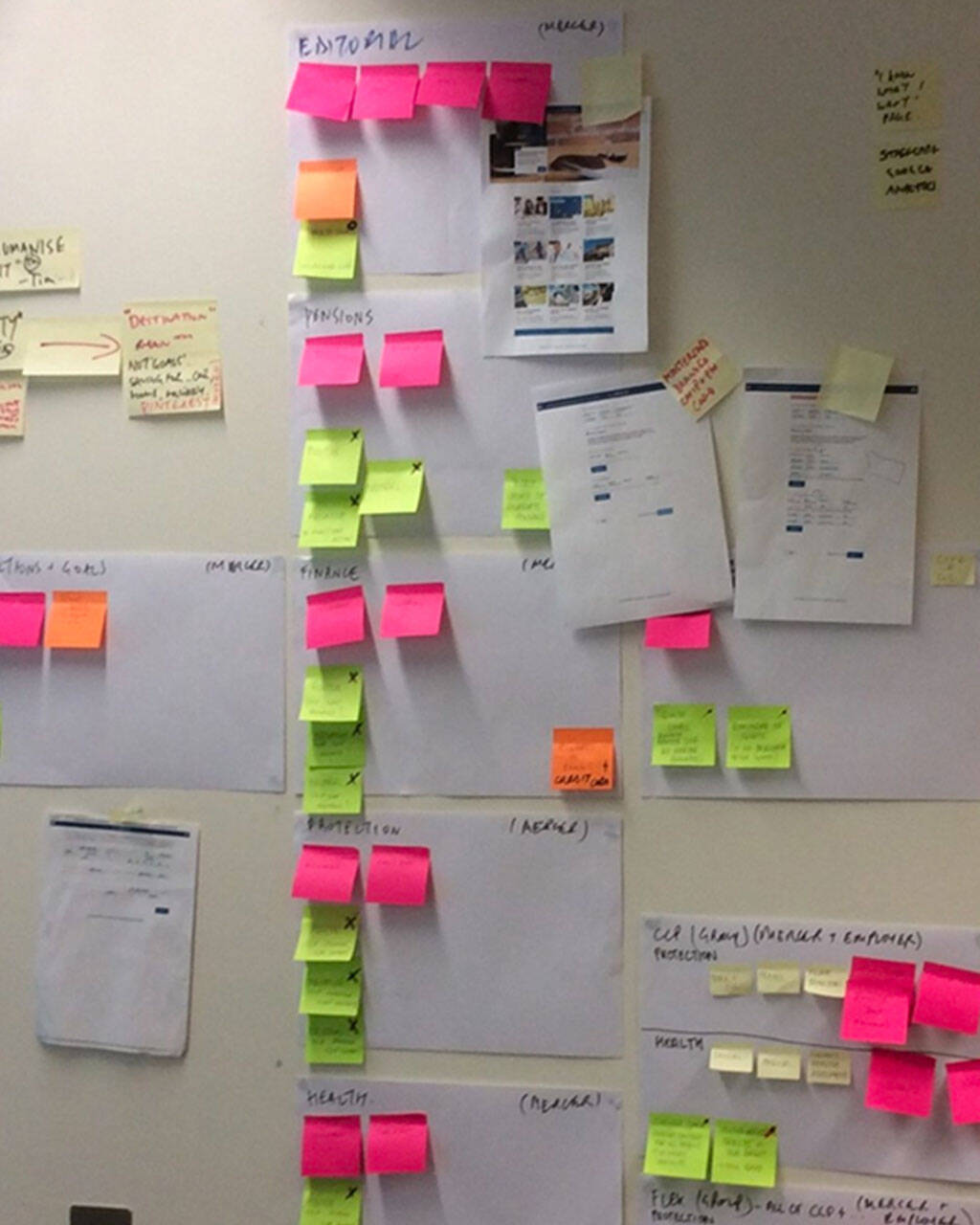
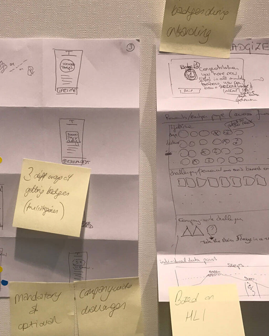
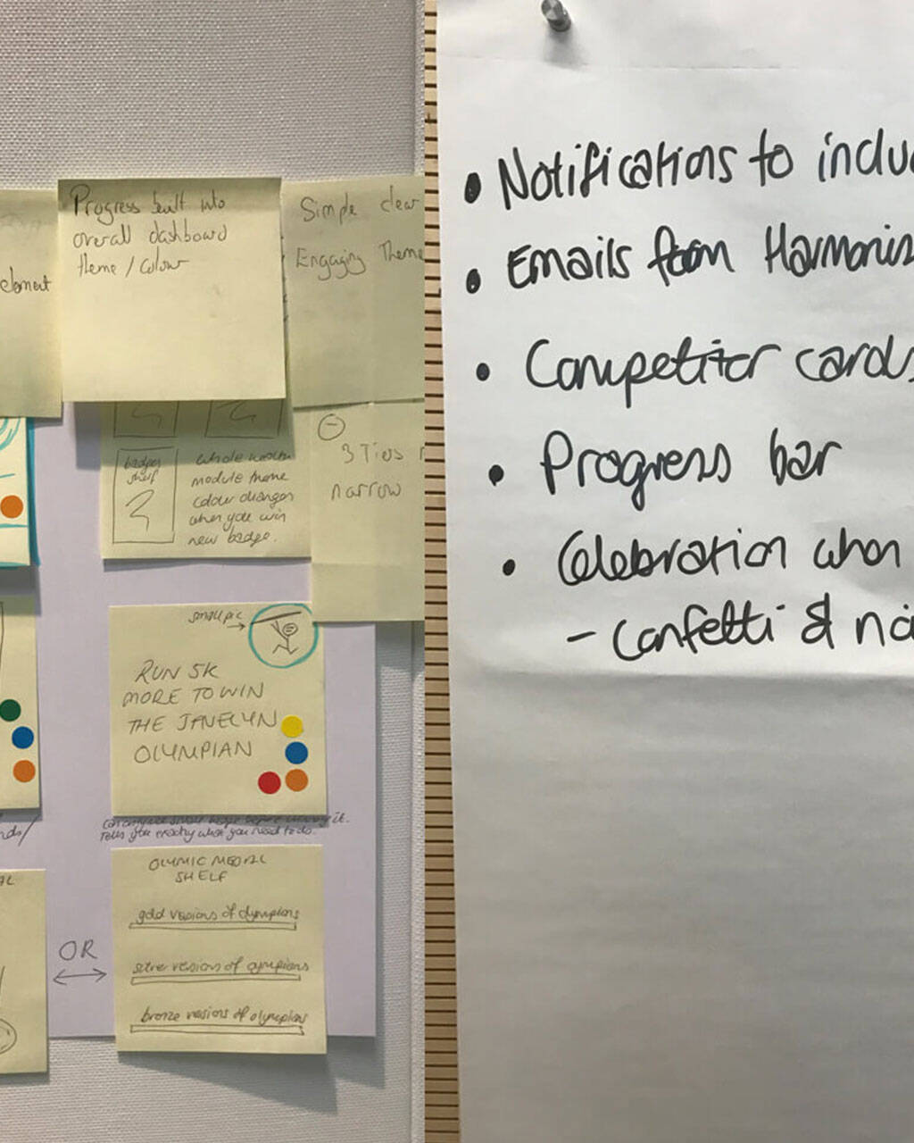
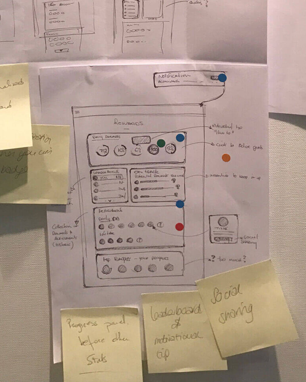
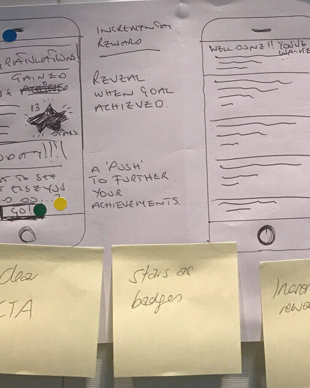
Our ideation sessions with stakeholders were focused and collaborative. We mapped out essential features, aiming for a flexible, intuitive platform that could scale. Concept mapping helped identify key touchpoints, guiding us toward a balanced solution, one that married usability with technical feasibility.
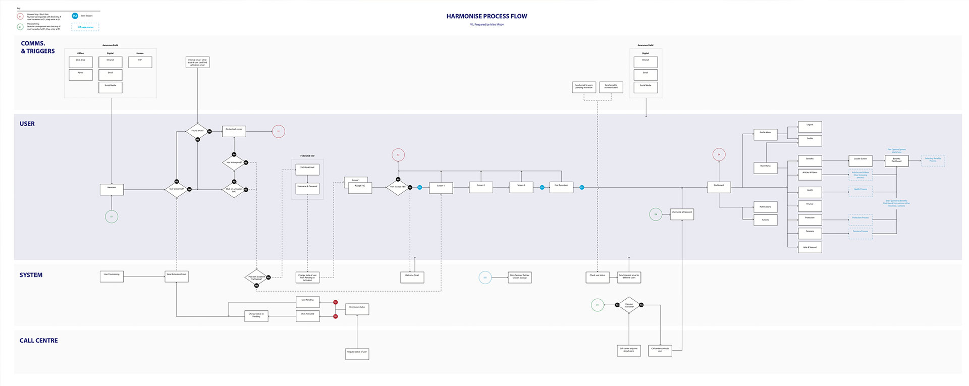
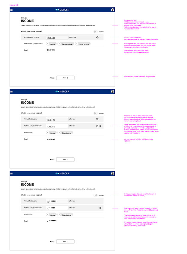
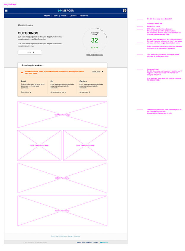
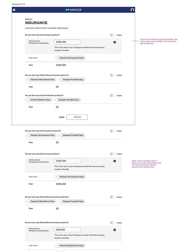
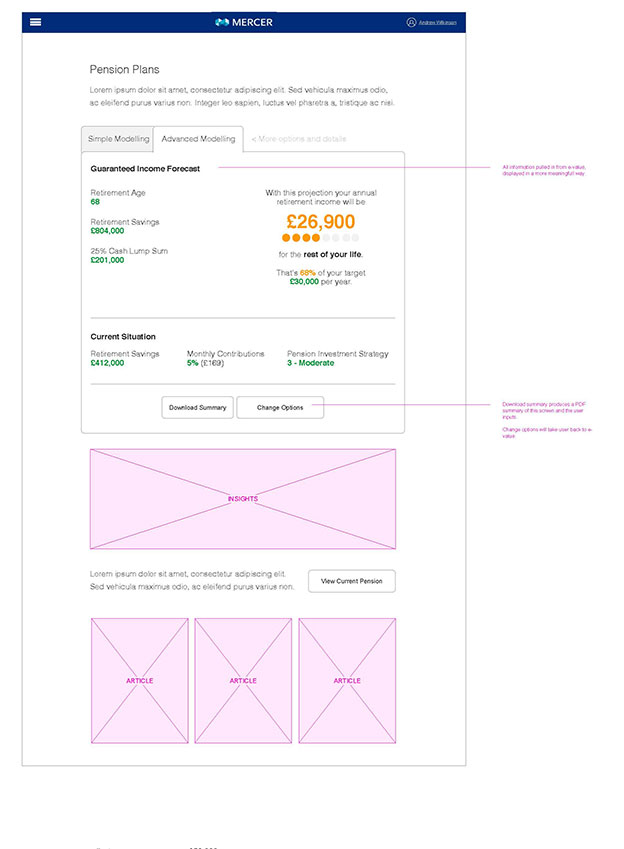
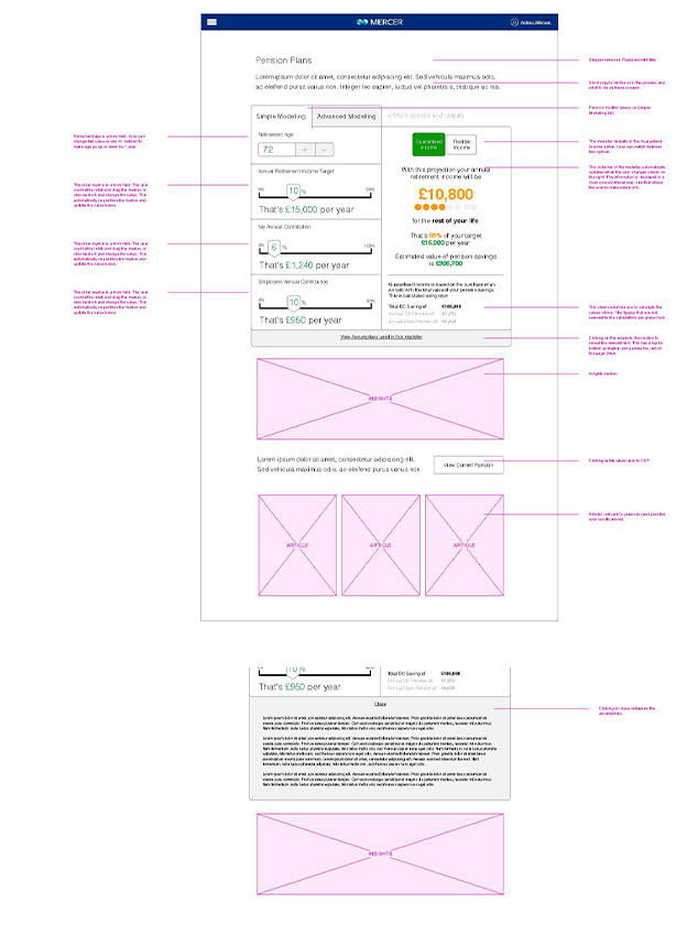
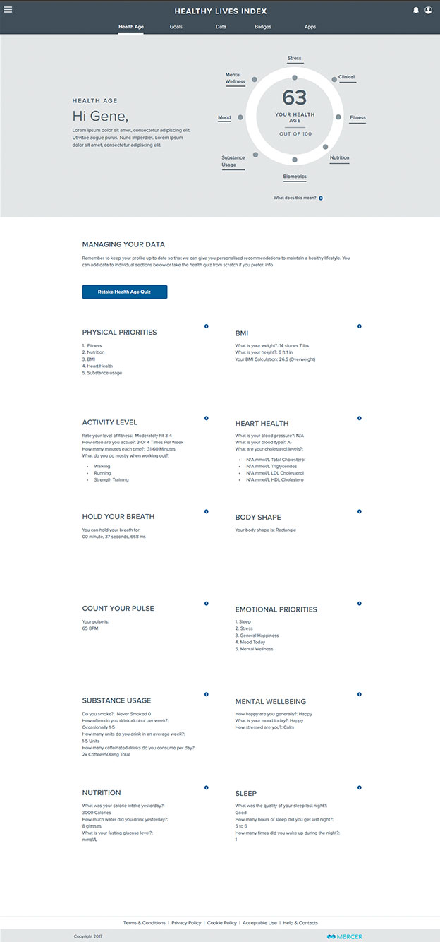
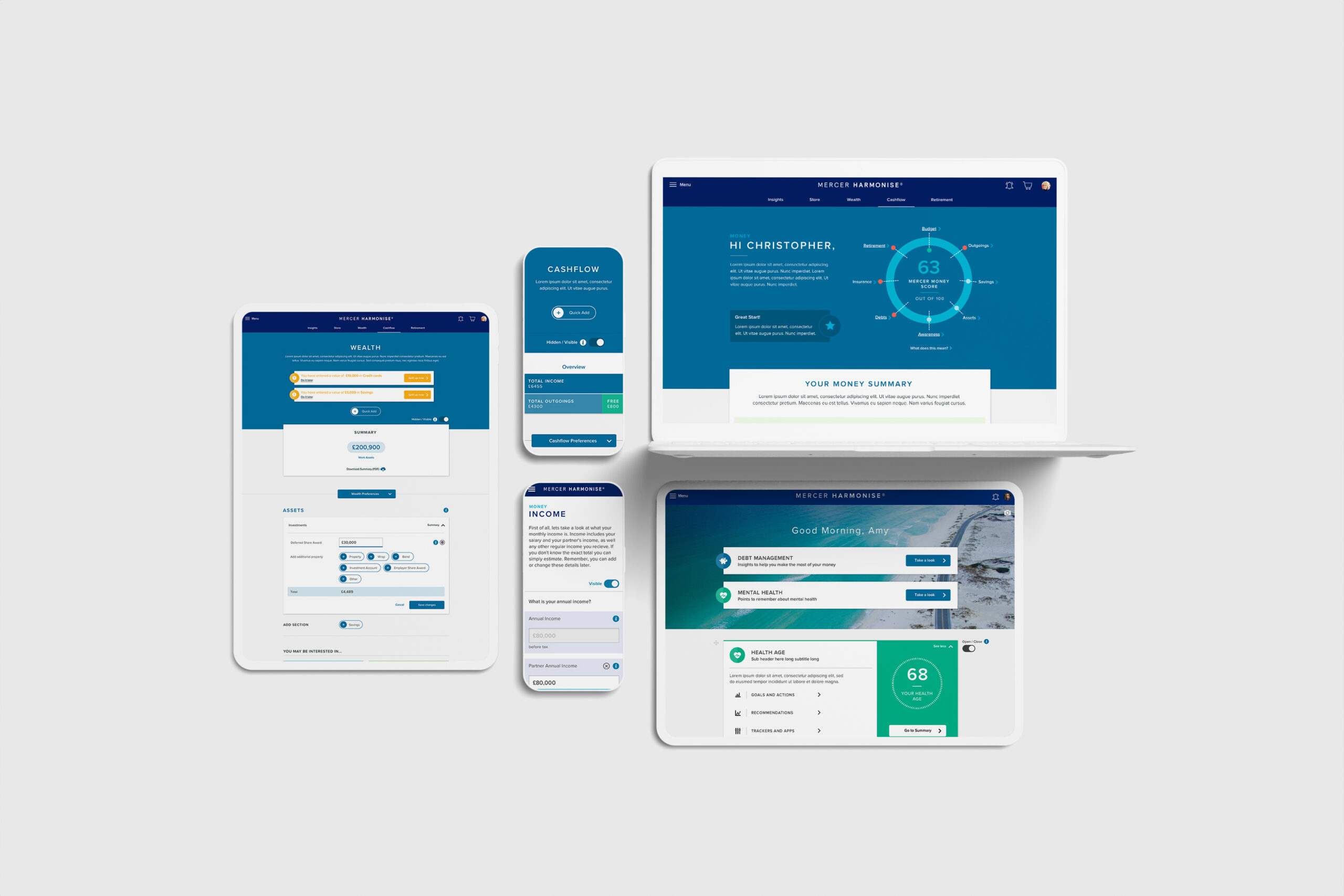
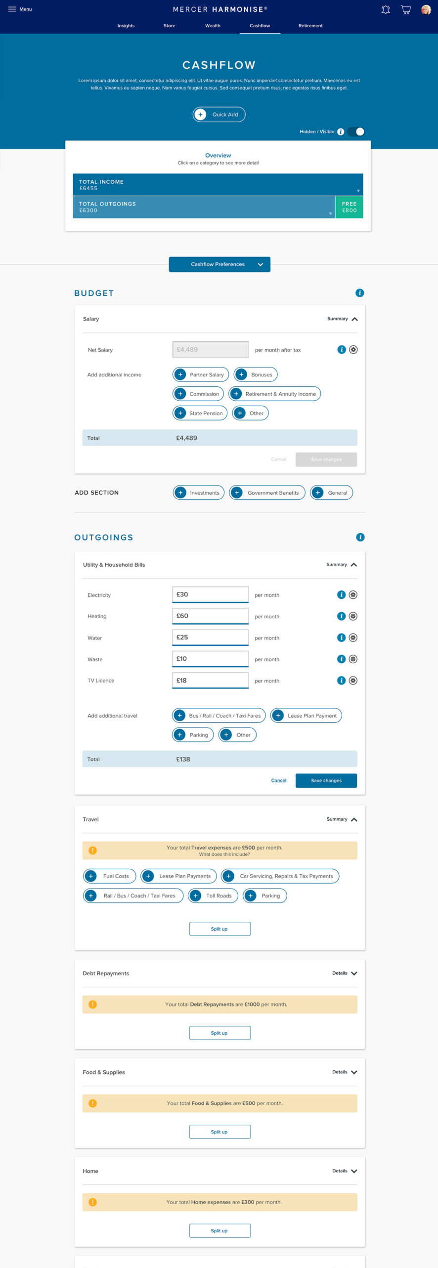
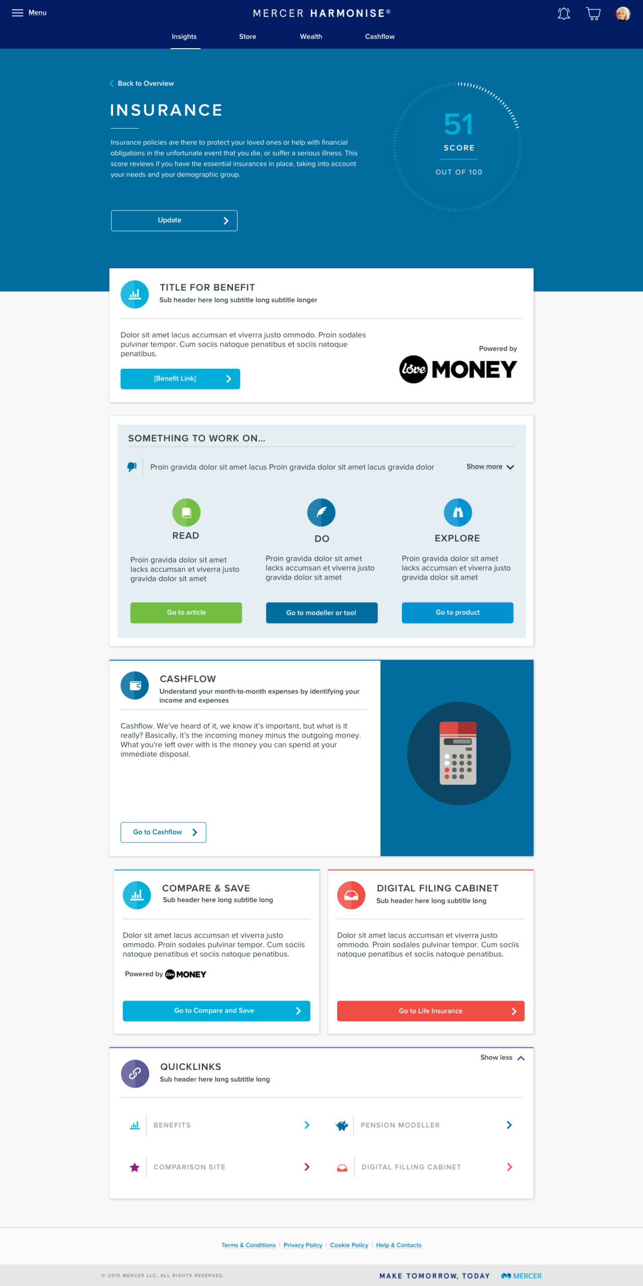
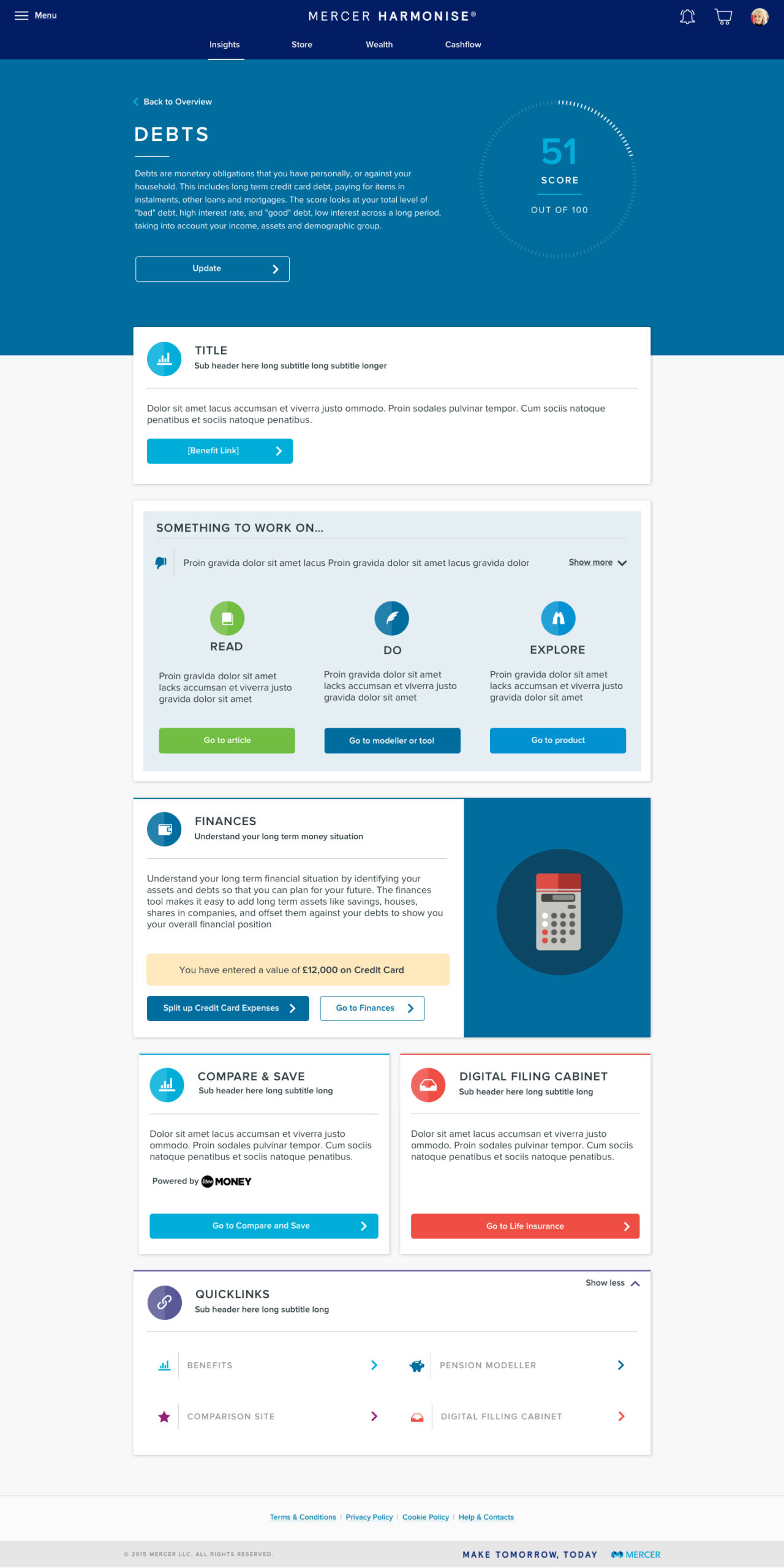
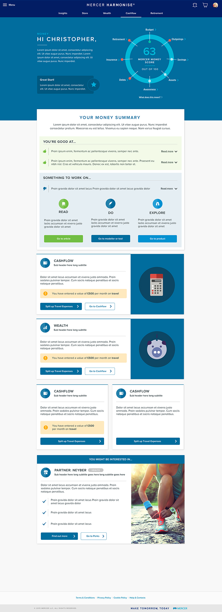
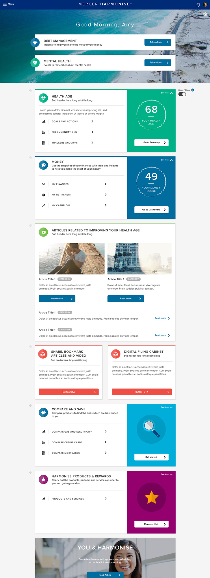
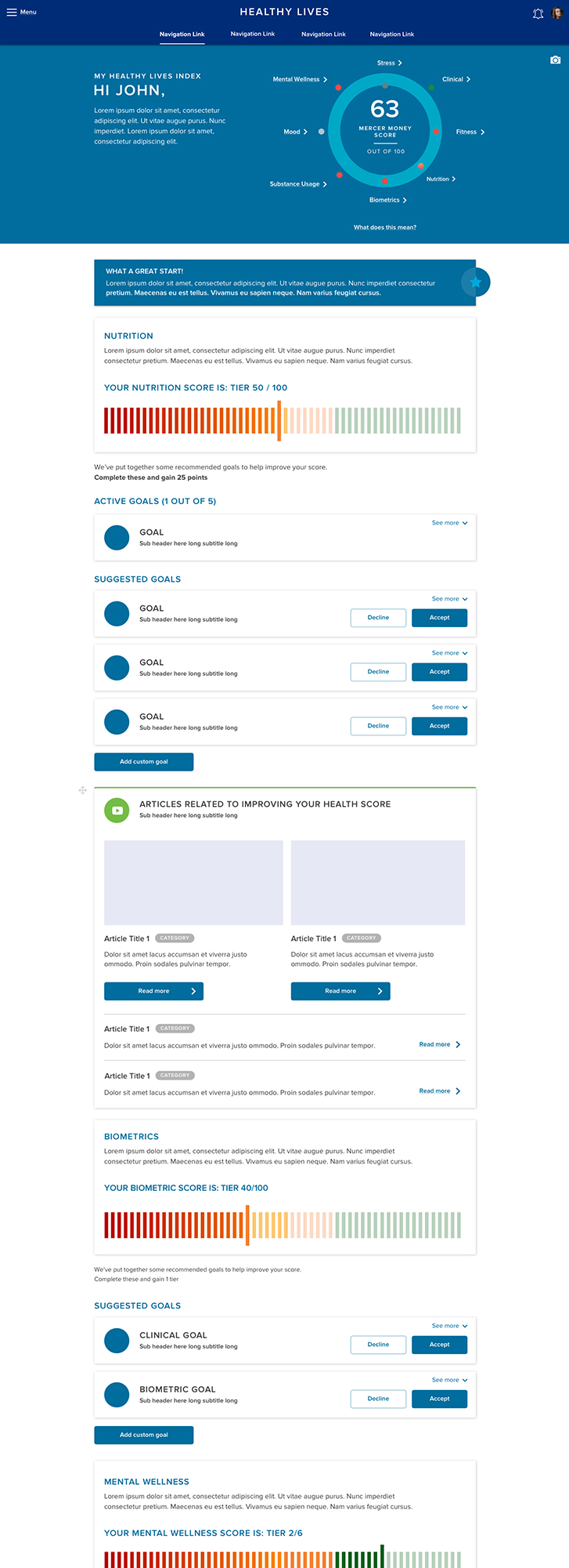
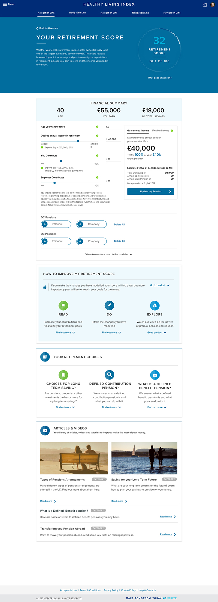
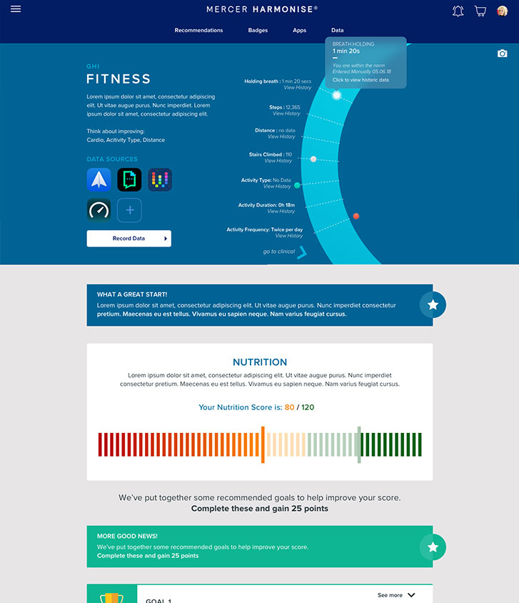
To bring it all together, we used service design to connect the dots across systems. Harmonise was built with a modular architecture, integrating financial tools, HR systems, and benefits platforms through APIs. Automation and predictive analytics added smart personalisation, while compliance and data security stayed firmly in focus.
Designing with Purpose
Working closely with stakeholders, we outlined the platform’s core features, always aiming for something intuitive, adaptable, and rooted in real-world use.
Early concept mapping helped us pinpoint key user touchpoints. From there, we shaped a holistic experience, one that balanced simplicity with depth, and accessibility with technical strength.
Service design was key to bringing it all together. We built Harmonise on a modular architecture, integrating financial planning tools, benefits systems, and HR platforms into one seamless experience. APIs powered real-time data exchange, while automation and predictive analytics enabled personalized, relevant guidance.
Every layer of the platform was designed with care, secure, compliant, and ready to evolve with the people it serves.
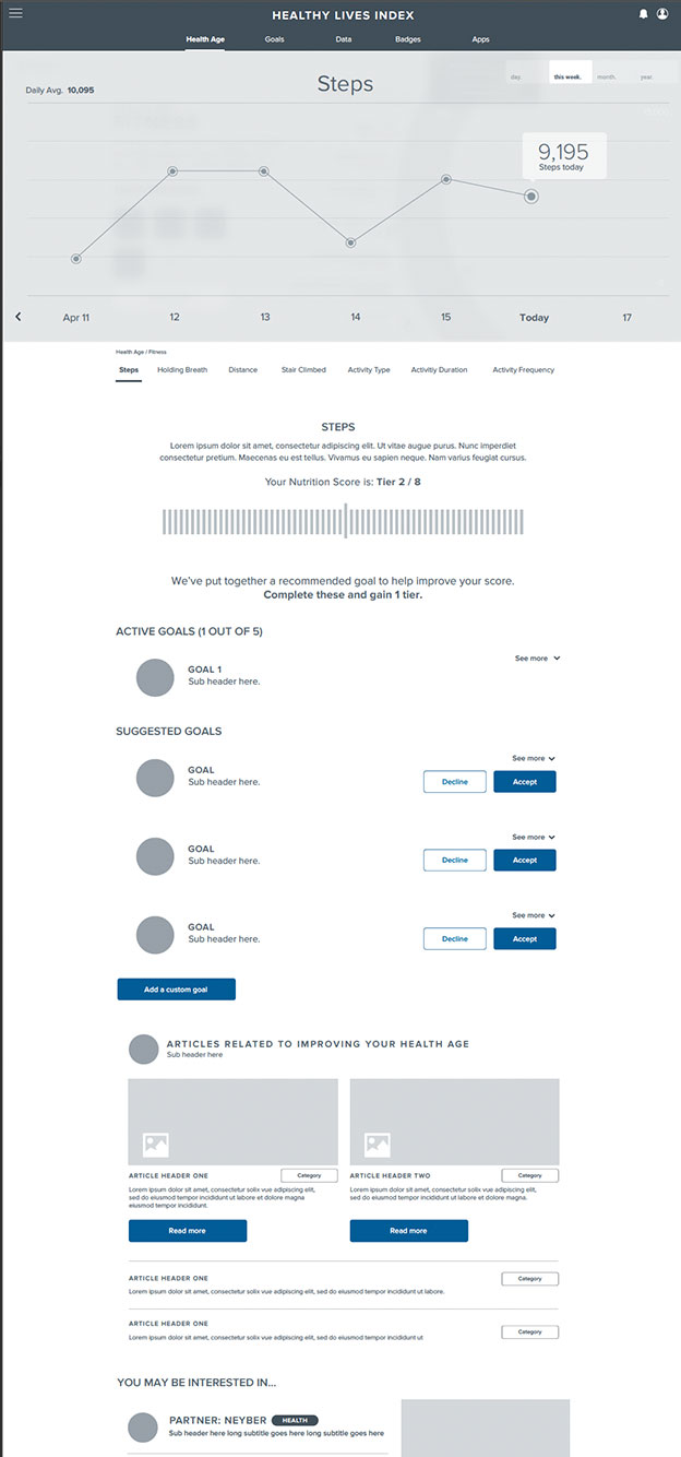
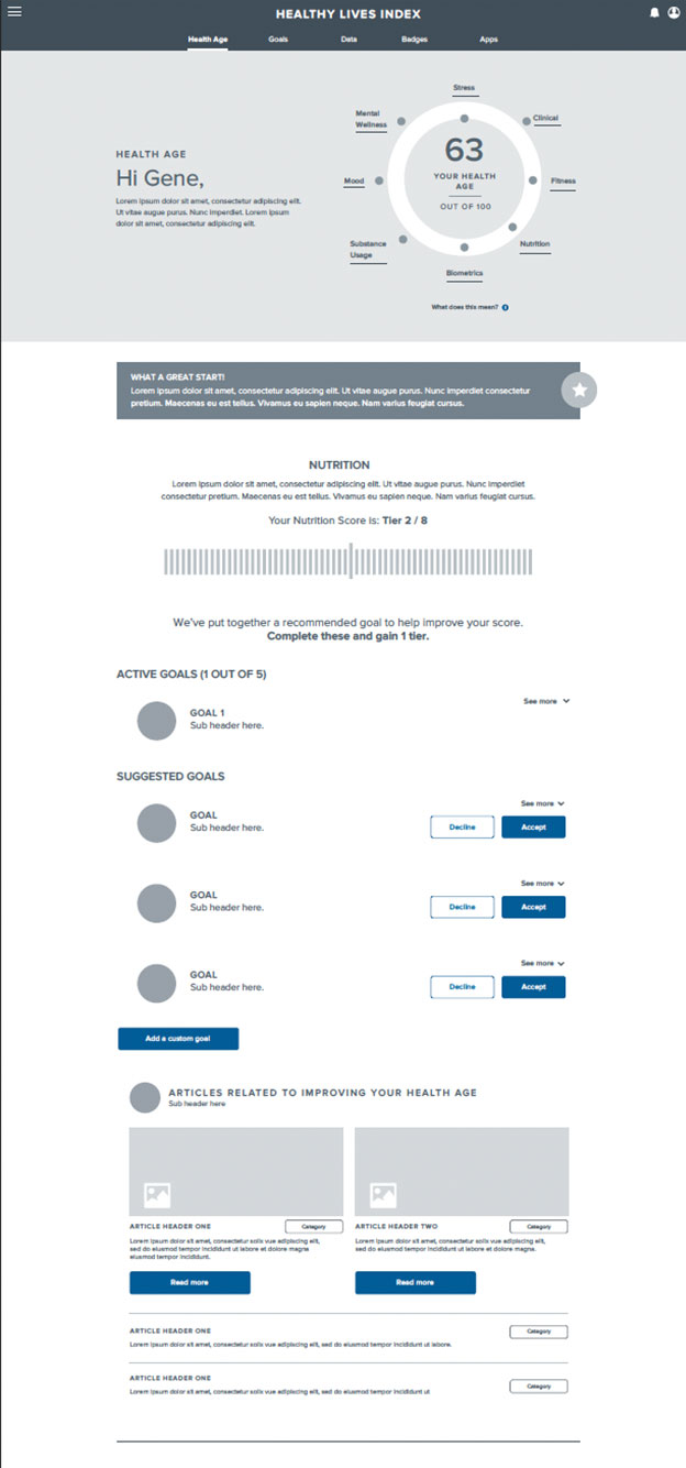
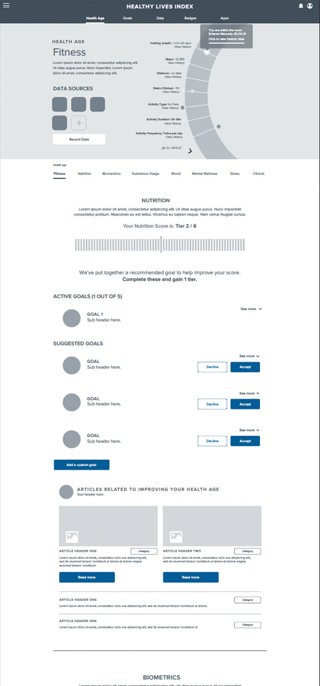
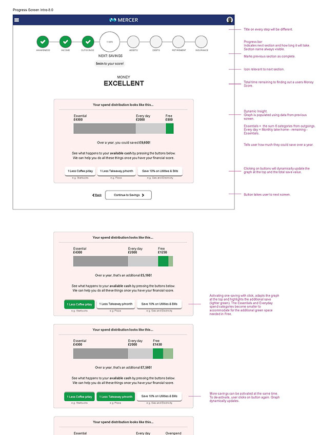
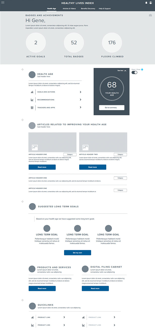
The insights we gathered were invaluable. We fine-tuned UI elements, enhanced accessibility, and ensured the platform was responsive across devices. Every decision was anchored in what would best serve users.
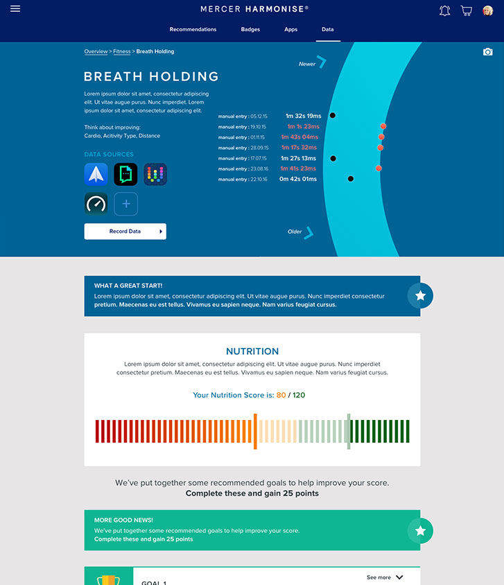
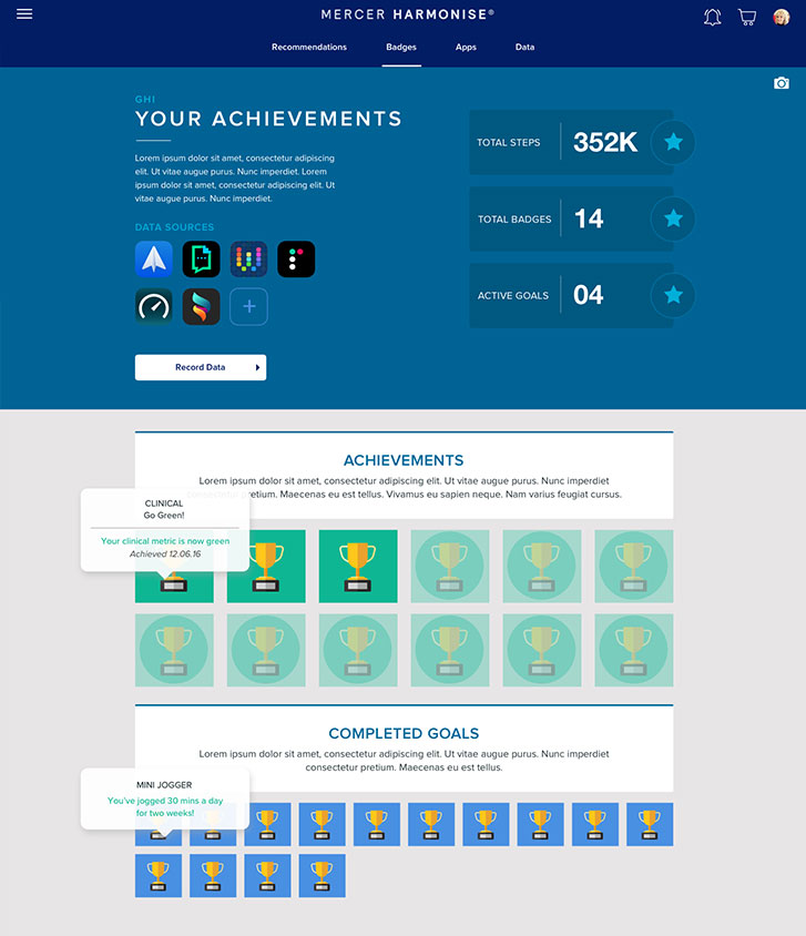
In the end, we delivered a mobile-friendly, data-driven experience, designed to be inclusive, engaging, and easy to navigate from day one.
Testing, Learning, and Refining
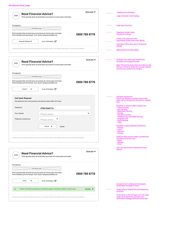
Throughout development, we stayed close to our users—testing, listening, and iterating every step of the way. We ran multiple rounds of usability testing with employees from a wide range of backgrounds, watching how they moved through the platform and where they got stuck. Their feedback was clear: simplify the language, sharpen the visuals, and make the mobile experience effortless. So we did.
We also ran A/B tests to see which design choices truly resonated, comparing layouts, buttons, and features to boost engagement. Feedback loops were essential. Through surveys and analytics, we tracked real user behaviour and made ongoing refinements to match their needs.
Employers were part of the process too, helping us ensure Harmonise integrated smoothly with existing HR and benefits systems. Their insights shaped technical improvements and validated functionality on the backend.
These validation efforts paid off, what emerged was a streamlined, user-friendly platform that genuinely supports both employee goals and employer systems.
Delivering Real Impact
When Harmonise launched, the response spoke volumes. Employees finally had a platform that met them where they were—simple, smart, and empowering. They could set goals, get personalized support, and access their benefits anytime, anywhere.
Employers saw value, too. With seamless integrations, clear data, and a more engaged workforce, they could support their teams more effectively while gaining the insights they needed to improve.
What started as a challenge to improve benefits delivery became something more: a connected, human-centered experience that made work better for everyone.
Lessons Learned as Lead UX
These takeaways will continue to guide my approach as a UX leader: always listening, always iterating, and always designing with people at the center.
Collaboration amplifies impact.
Co-creating with employees, stakeholders, and cross-functional teams consistently led to stronger, more inclusive solutions. The best ideas came not from individual genius, but from shared insight.
Research never ends.
While early discovery set the direction, continuous user feedback throughout the build ensured we stayed aligned with real needs. Testing wasn’t a phase, it was a mindset.
Simplicity is powerful.
In a space as complex as financial wellbeing and HR tech, designing for clarity and ease made all the difference. Stripping away jargon and friction helped people connect with the tools they needed.